Schiaparelli: ‘I Like to Amuse Myself Through Some of my Creations. If I Didn’t, I Should Die’
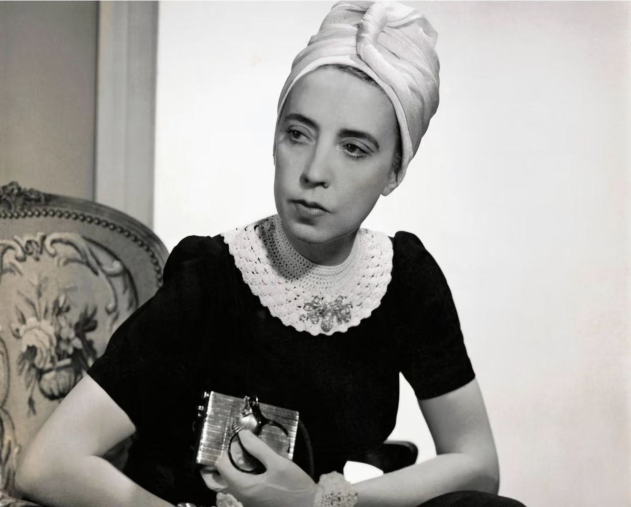
Elsa Schiaparelli in 1940. Photograph: Fredrich Baker/Conde Nast/Getty Images

Elsa Schiaparelli redefined fashion in the 1930s. She created sensuous clothes that caught the eye, that embraced new techniques and materials, that shocked and amused. Above all, she articulated the artistic spirit of her day. (‘Schiaparelli: Fashion Becomes Art’ is at the V&A, London until 8 November.)
 
‘For me, dress designing is not a profession, but an art.’
Elsa Schiaparelli

Born in Rome in 1890, into an aristocratic family, Schiaparelli was educated at a strict Swiss convent school. Breaking free from her conservative upbringing, she spent time in Paris, London and New York, marrying a charismatic conman with whom she had a daughter. Following the breakdown of this relationship, she fell in with the Surrealist set, including the writer Gabrielle Buffet‑Picabia and the artist Man Ray.

'Belief is as necessary to the soul as pleasures are necessary to the body.'
 
In 1922 Schiaparelli moved with her child to Paris, where she took a role as designer at a small fashion house. Although she had had no formal training, in 1927 she presented her first solo collection of hand‑knitted sweaters with geometric patterns. The piece that made her name was a black-and-white jumper with a trompe l'oeil bow‑knot. 
 
‘I wore it at a smart lunch and created a furore… Soon the restaurant of the Paris Ritz was filled with women from all over the world in black-and-white sweaters.’

Schiaparelli opened her first shop in 1928 on rue de la Paix. Branded ‘Schiaparelli Pour le Sport,’ it sold knitted pullovers, simple tops and skirts, as well as beachwear and ski attire. She subsequently added stylish, practical daywear, ‘Pour la Ville,’ and glamorous eveningwear, ‘Pour le Soir.’
 
‘Simple suits, mandated apparel.’
 
Schiaparelli’s day-suits featured unusual fabrics with unexpected fastenings and prominent pockets. There were lively novelty prints, depicting Parisian landmarks, disembodied hands, floating red hearts and newspaper cuttings about herself. Trousers were to the fore, at a time when most women wore them just for sport or informally at home. 
 
‘In the building of a basic wardrobe, we cannot go wrong if we strive for simplicity and perfect fitting.’
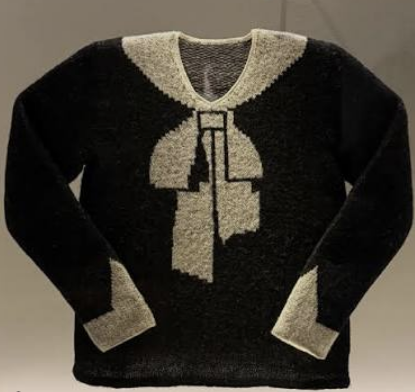
Elsa Schiaparelli - Black-and-white jumper with a trompe l'oeil bow‑knot

Schiaparelli’s evening gowns were dramatic, sinuous and shimmering. With distinctive epaulettes, folded sleeves and daringly‑deep back décolletage, they boasted form‑hugging silhouettes and took inspiration from disparate sources: classical architecture, Harlequin costumes and the circus; military uniforms and Russian parachutists. She experimented with bustles, velvet capes, head scarves and hoods; with prominent zips and asymmetric drapery; with apron‑style over‑tunics and camouflage. And she worked with textile manufacturers to explore innovative materials - crinkly textures, cellophane, metallic threads and woven glass. Her designs consistently came in strong colours - sleeping blue and pirate red; ocean green and her signature shocking pink - with unexpected juxtapositions, like beetroot and salmon.
 
‘Before me, everything was black or navy blue or grey or brown or beige, things like that, for daytime. I began using shocking pink and ice blue and all kinds of bright colours.’
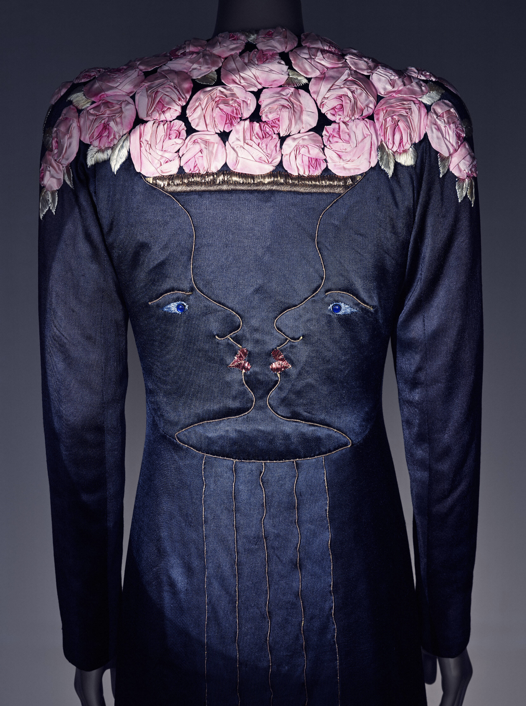
Evening coat, designed by Elsa Schiaparelli and Jean Cocteau, 1937, London, England

Schiaparelli’s smartly tailored jackets completed her evening suits. Made from sumptuous textiles, with oversized pockets, they were graced with characterful buttons - ships and mirrors, playing cards, candlesticks and crowns – and embellished with exquisite embroidery by Maison Lesage – designs featuring flowers, starbursts and musical instruments.
 
‘Fortunately, or unfortunately for me, I am always at my best when I am unhampered: when I can let myself go and have a little fun.’
 
Within five years, Maison Schiaparelli was employing 400 staff and manufacturing over 7000 garments per annum. In 1935, Schiaparelli moved her couture business to 21 Place Vendôme, one of the most elegant addresses in Paris. Its window displays starred two articulated wooden figures, Pascal and Pascaline, performing in witty theatrical scenes. Inside there were screens painted by her artist friends, and light fixtures designed by Alberto Giacometti. 
 
‘There are times to be casual and times to be correct. It's alright to wear a sweater and slacks on a picnic, but they don't belong in the theatre or the drawing room.’
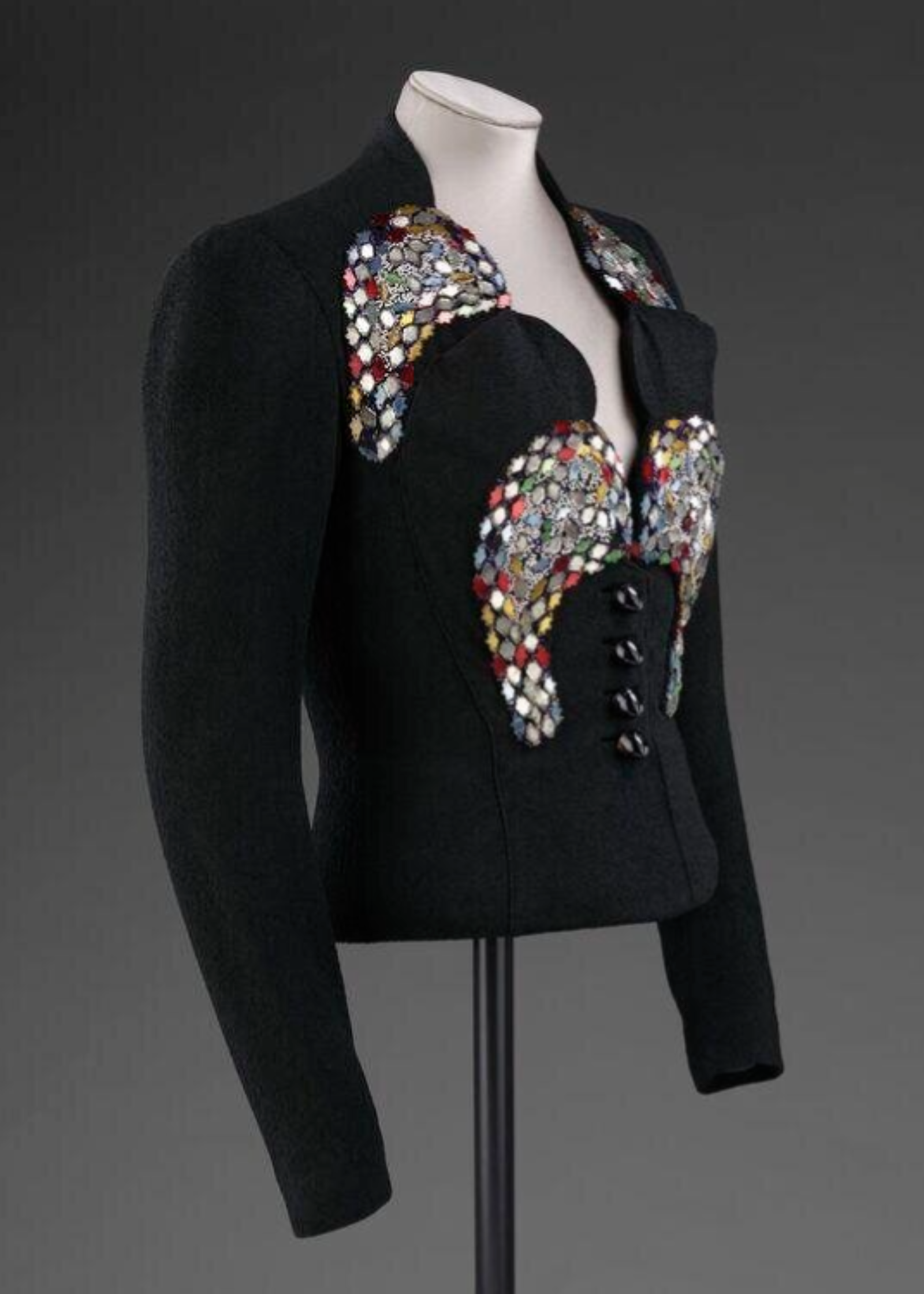
Elsa Schiaparelli - Circus Evening Jacket. February 1938 (made)

The larger space at Place Vendôme enabled Schiaparelli to sell accessories, perfumes and cosmetics. Her first fragrance, S, was unisex. She went on to create Snuff, a scent for men in packaging shaped like a pipe (a reference to René Magritte’s ‘This is not a pipe’ painting). Night-time perfume Sleeping came in a vessel formed like a lit candle, and best-seller Shocking had a bottle based on Mae West’s hourglass figure. One journalist wrote of her Salut scent:
 
‘This is what Salut does for a girl… A drop behind each ear and you feel you’ve had good news. A spray around your neck and Marlene Dietrich had better look out.’
 
Schiaparelli developed a following of confident, wealthy women who wanted to make a mark. Her clients included Wallis Simpson and Nancy Cunard; Mae West and Josephine Baker; Dietrich, Garbo and Hepburn. Bettina Ballard, the Paris correspondent for American Vogue, observed of the typical Schiaparelli customer:
 
‘Wherever she went [she was] protected by an armour of amusing conversation‑making smartness.’
 
A striking playfulness ran through Schiaparelli’s work. She designed shoes in stripes, gloves with faux fingernails. And at a time when hats were required daytime wear for women, her creations – in plant fibre, felt or fur - included a birdcage, a lambchop and an upside-down shoe. 
 
‘The spirit of infectious good humour can be created even through women’s hats. I like to amuse myself through some of my creations. If I didn’t, I should die.’
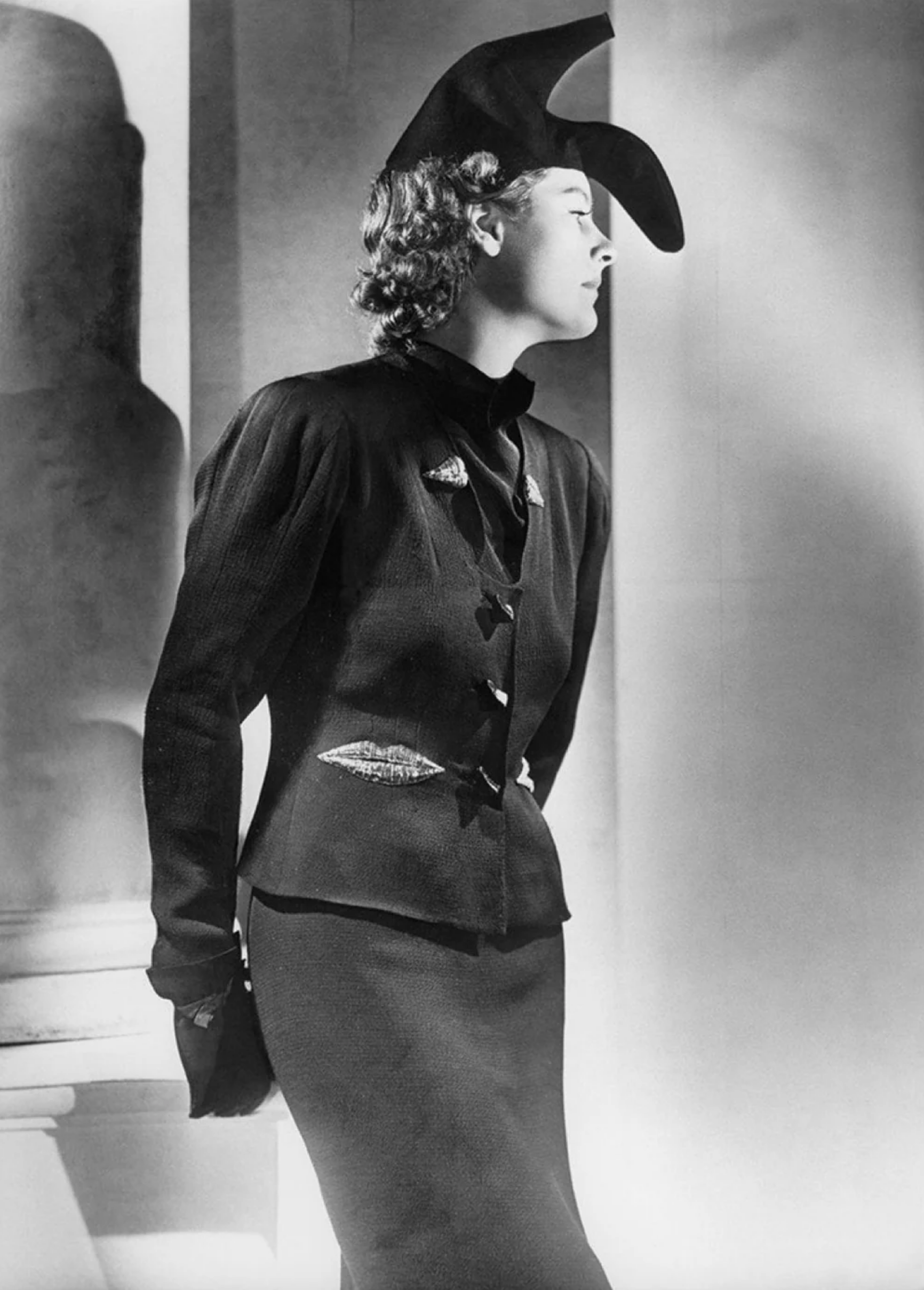
Elsa Schiaparelli and Salvador Dali - The shoe-hat
Schiaparelli Haute Couture Winter 1937-38 collection.
Inspired by a photograph that Gala, (Dali's wife) had taken of her husband wearing a woman's shoe.

Schiaparelli’s wit, her love of the absurd, erotic and subversive, derived from her enduring association with the Surrealists. She commissioned contemporary artists to co-create designs for garments and accessories; for her advertising and boutiques. Indeed, such was her affection for the avant garde that her rival ‘Coco’ Chanel dismissed her as ‘that Italian artist who’s making clothes.’
 
‘Women dress alike all over the world: they dress to be annoying to other women.’
 
Schiaparelli worked particularly closely with Salvador Dalí and Jean Cocteau. One coat at the exhibition is embroidered on the back with a Cocteau drawing of mirrored, kissing faces which, in profile, trace an urn of roses. Inspired by Dali, Schiaparelli created a gown with a dramatic lobster print, and a frock that gives the impression of torn fabric. Her Skeleton Dress, co-designed with Dali, has quilting resembling a rib cage, vertebrae, hip and leg bones.
 
‘A successful designer must be a gambler.’
 
Schiaparelli teaches people working in commercial creativity to approach their craft with vigour and courage; to integrate humour, however serious the endeavour; to embrace the ideas and influence of contemporary art. 
 
‘More than life I cherish freedom.’
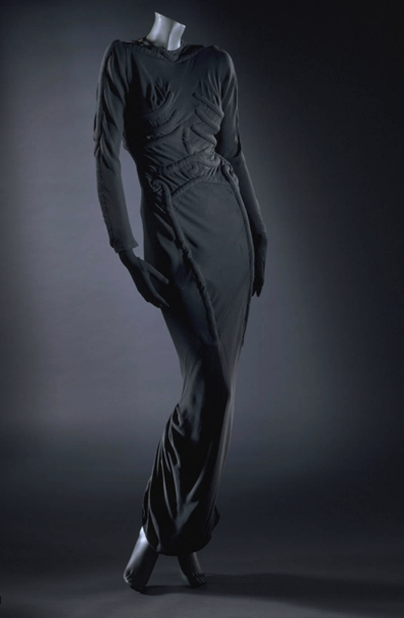
The Skeleton Dress - Elsa Schiaparelli and Salvador Dali
Evening Dress, 1938 (made)

Schiaparelli spent most of the Second World War in New York. Having returned to Paris in July 1945, she continued to design collections. But post-war austerity and Christian Dior's ‘New Look’ combined to create challenging trading conditions. She terminated her couture business in 1951, and in 1954 she closed the doors of her salon. She lived out a comfortable retirement between her Paris apartment and her house in Tunisia, and died in 1973, at the age of 83.
 
‘Nobody has been able to pronounce [my name] properly… but everybody knows what it means.’
 

'I am a lonely painter,

I live in a box of paints.
I'm frightened by the devil,
And I'm drawn to those ones that ain't afraid.
I remember that time you told me, you said
"Love is touching souls."
Surely you touched mine.
'Cause part of you pours out of me,
In these lines from time to time.’
Joni Mitchell, ‘A Case of You'

No. 588

V&A East Storehouse: Everything Everywhere All at Once

V&A Storehouse

V&A East Storehouse is the open-access depository for the Victoria & Albert Museum’s collection of art, design, fashion and performance. With a total floorspace of 16,000 square meters (over 30 basketball courts) and spanning four levels, it is based in Hackney Wick, London, on a site originally used as the media centre for the 2012 Olympic Games. It is free to enter.
 
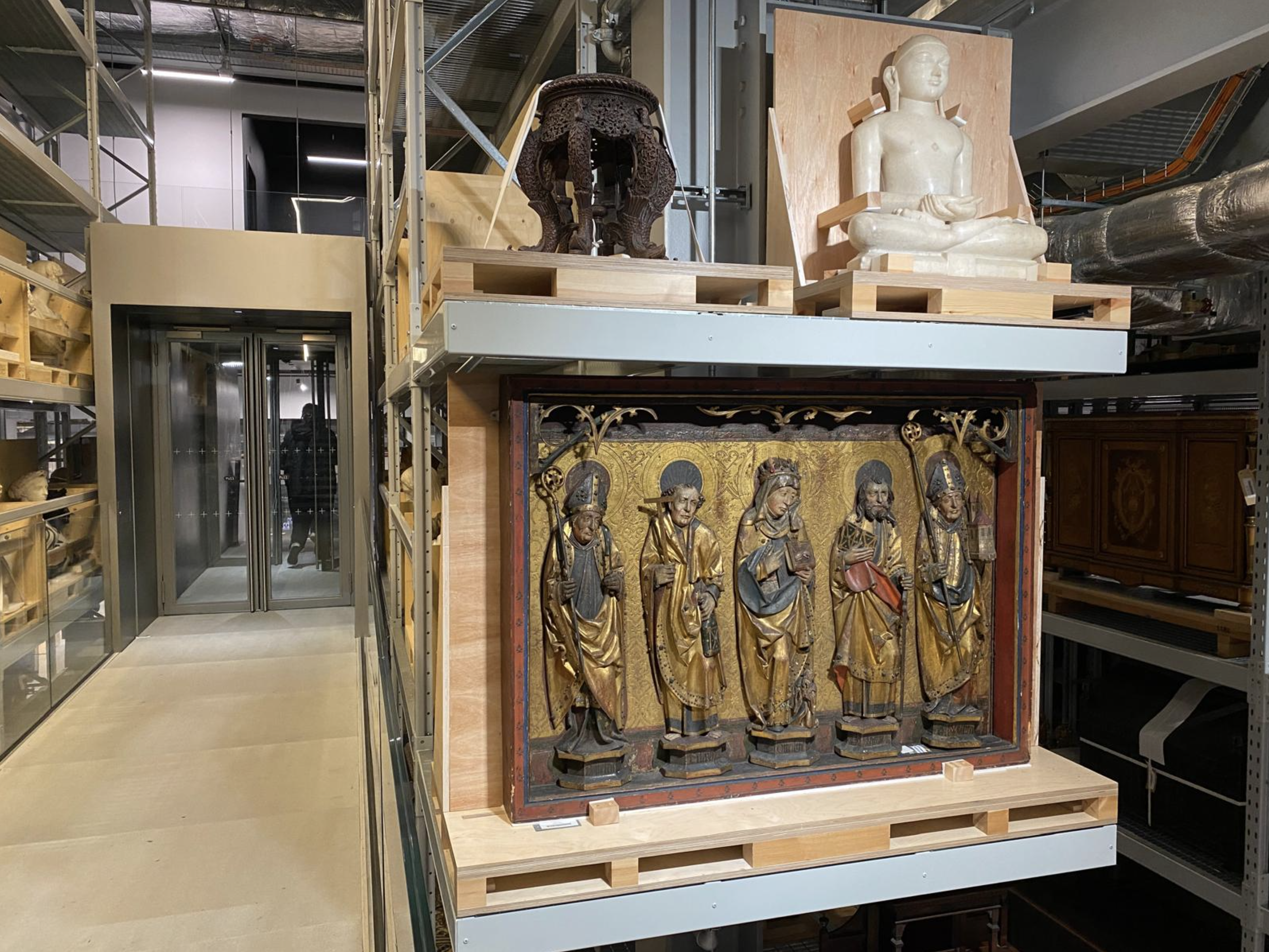
Walking up the stairs, through an airlock, I found myself in a world of steel, glass and gantries; of spacious aisles, long shelves and open crates – all artificially lit from above to protect the exhibits. 
 
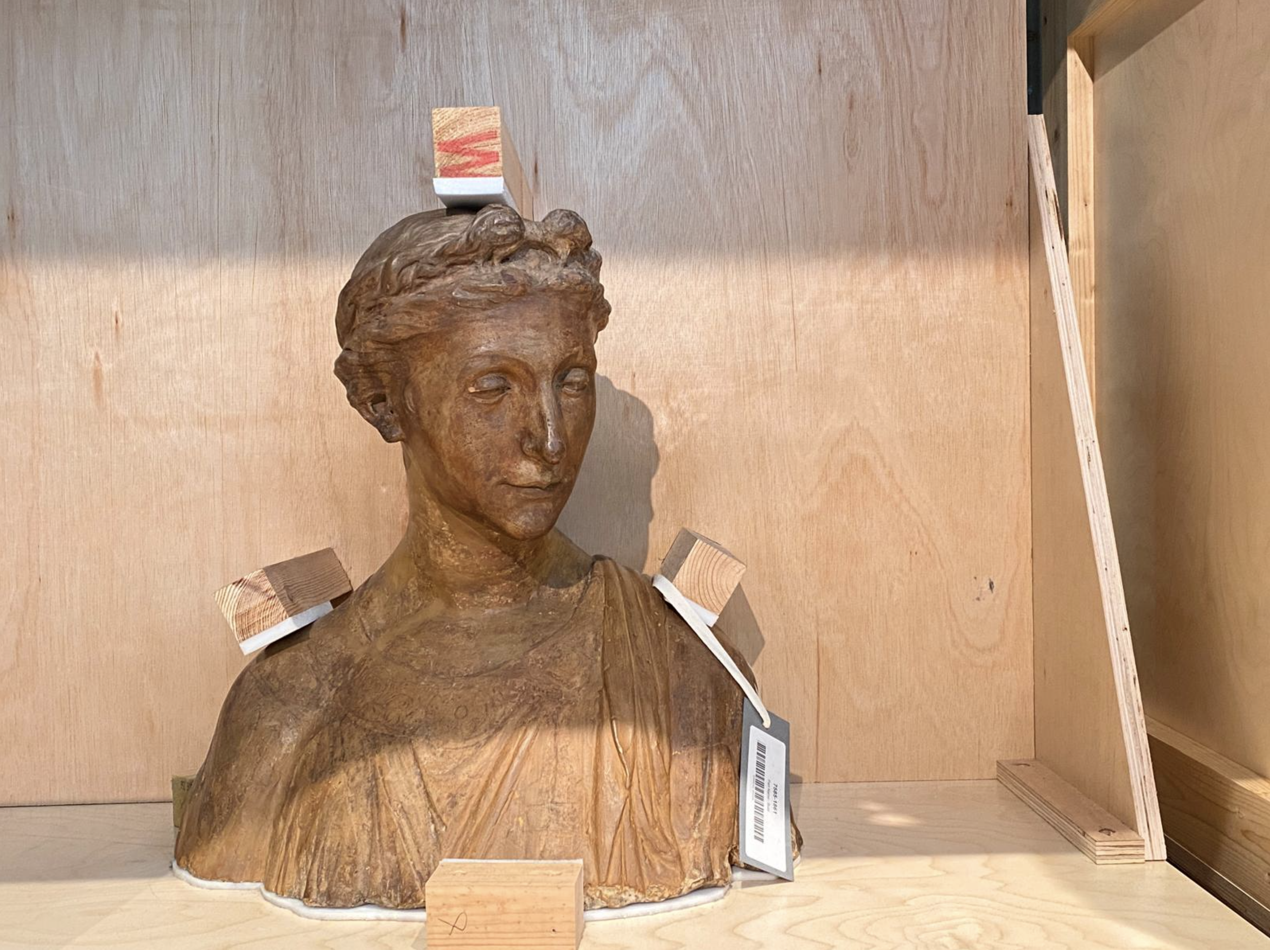
I passed marble heads, ornate furniture and colourful vases; cherubs, chessboards and chimney pots. Here was an example of Palestinian embroidery, a collection of Yemeni funerary stelae. Over there, costumes and cannons; street signs, an abacus, a wireless and some grandfather clocks. Through the glass floor-window, a carved colonnade from Agra.
 
Everything was carefully catalogued and bar coded – but, at the same time, the collection was completely jumbled up. 
 
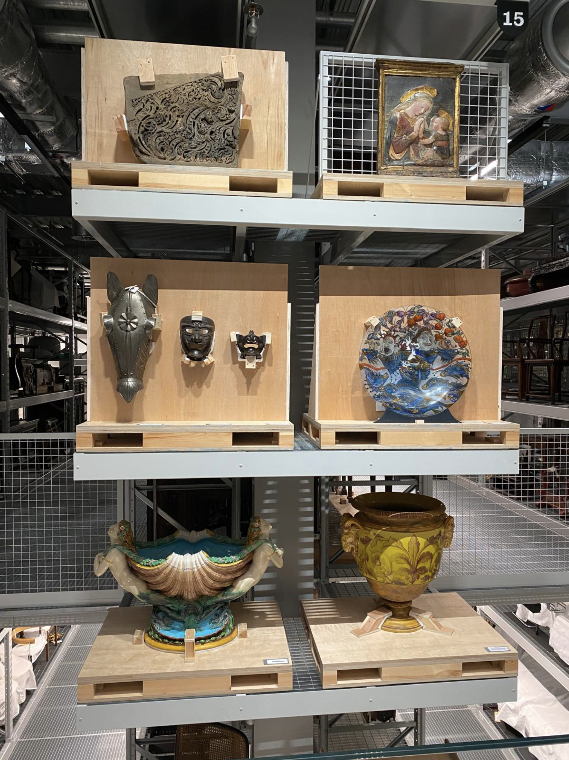
Arms and armour, rococo mirrors, a gleaming motorbike and a ‘70s mug collection. A Minitel 1 computer terminal. A small child’s West Ham top, sponsored by ‘BAC, the window people.’
 
A middle-aged woman walked past, observing to her husband:
 
‘They seem to have had a lot of boxes in the olden days.’

V&A Storehouse

I was feeling a little disorientated. I yearned for some commentary to make sense of it all - something to aid insight and understanding; to illuminate theme and variation. However, the collection is arranged by the sizes and weights of the objects. And, with the exception of some highlight-displays at the end of each storage rack, there is no attempt at formal categorisation or neat narrative. 
 
A sign asked for Feedback:
‘What new stories could we tell about our objects?’
 
Underneath, someone had complained: 
‘Silence is a terrible narrator.’
 
To be fair, visitors are invited to scan QR codes to learn more about some of the objects. But I’m too old for that now, and it reminds me of Covid. There is also an Order an Object service, by which you can arrange an appointment to see up to 5 pieces from the collection in a private study room.
 
Most people were, like me, just wandering around, taking it all in, peeking at anything that caught their eye.

V&A Storehouse

Past some ceramic tiles, tribal masks and a toy truck. A gilded altarpiece, a corset and a double bass. Blue plaque, bike, Budha, Bowie setlist. 
 
At length, I overheard a Young Person exclaim in delight:
 
‘Every 2 seconds I’m seeing something and thinking: Yo, that’s so cool!’

Adopting this mindset, I determined to let myself go; to give in to the infinite variety; to be curious, available for interesting juxtapositions, for serendipity.
In the accompanying literature, one of the architects described the experience as ‘an immersive cabinet of curiosities.’ I found myself grasping for other analogies. It’s like channel surfing; walking through the internet of things; a garden of culture. It’s like Charles Foster Kane’s vast collection of antiquities. It’s the multiverse. It’s everything everywhere all at once.
 
I came across a couple of set-piece show-stoppers: the Kaufmann Office, a complete honey-coloured interior, designed in the 1930s by Frank Lloyd Wright for a Pittsburgh retail magnate; the Frankfurt Kitchen, a pistachio exercise in minimalist functionality, created in the 1920s by Margarete Schütte-Lihotzky, and installed in 10,000 flats.

V&A Storehouse

And then there was a melancholy display of remnants from a now demolished Brutalist housing estate in nearby Polplar, Robin Hood Gardens. And some toiles that fashion students have crafted, based on original designs by Balenciaga – an imaginative exercise to better understand his technique.
 
Shoes, chandeliers, a painted tiger and a bus conductor. I could go on…
 
I’d certainly recommend a visit to the V&A East Storehouse. You just need to adopt the right mentality: set aside the Strategist’s craving for order and explanation; relax, be inquisitive, and open yourself up to stimulation and inspiration.
 
Finally, back to the Visitor Feedback:
‘What new stories could we tell about our objects?’
 
In a flamboyant scribble, a Young Person had requested:
‘Haunted, demonic and possessed, puhlease!!!’
 
Exactly.
 
 
'A police car and a screaming siren.
A pneumatic drill and ripped up concrete,
A baby wailing and stray dog howling,
The screech of brakes and lamp light blinking,
That's entertainment.
A smash of glass and a rumble of boots,
An electric train and a ripped up phone booth,
Paint splattered walls and the cry of a tomcat,
Lights going out and a kick in the balls.
I say, that's entertainment.
That's entertainment.
Days of speed and slow time Mondays,
Pissing down with rain on a boring Wednesday,
Watching the news and not eating your tea,
A freezing cold flat and damp on the walls.
I say that's entertainment.
That's entertainment.’
The Jam, ’That’s Entertainment’ (P Weller)

No. 577

‘An Intenser Expression’: David Bomberg on Building Life and Art Anew

David Bomberg 1890–1957 Vision of Ezekiel 1912

David Bomberg 1890–1957 Vision of Ezekiel 1912

'We must build our new art life of today upon the ruins of the dead art life of yesterday.’
David Bomberg

I recently visited a small exhibition of the early work of British artist David Bomberg. (The National Gallery until 1 March.) 

Bomberg was born in Birmingham in 1890, the seventh of eleven children. His parents were Polish Jewish immigrants who subsequently settled in Whitechapel in London’s East End. He grew up in poverty, but single-mindedly pursued an artistic career. After a chance encounter at the V&A with the established painter John Singer Sargent, he gained a place at the Slade School. 

‘I hate the Fat Man of the Renaissance.’ 

Whereas the British art establishment of the day steadfastly resisted the innovations that were taking place on continental Europe, Bomberg was one of a number of young painters who were emboldened by the likes of Picasso and Matisse. He gradually developed a radical style that combined the abstraction of cubism with the dynamism of futurism.

When he was 22 Bomberg’s mother died of pneumonia. She was just 48. He channelled his grief into 'Vision of Ezekiel,' a work that considered the biblical story in which a prophet is taken to the Valley of Dried Bones and witnesses their resurrection.

'And he said unto me, Son of man, can these bones live? And I answered, O Lord God, thou knowest.'
Ezekiel, Chapter 37

The geometric figures in ‘Vision of Ezekiel’ dance with pure joy, hug one another, and raise their hands ecstatically to the heavens. They are in awe at what has happened to them, animated with a renewed lust for life. It is a heartfelt work.

Detail from David Bomberg In the Hold, about 1913-14 © Tate

Detail from David Bomberg In the Hold, about 1913-14 © Tate

Bomberg’s paintings around this time responded to his family’s experiences and to the world around him. He was inspired by the muscular activity at the Judeans gymnasium where his brother trained as a boxer; by the dramas played out at Saint Katharine’s Wharf where ships brought in human cargoes of immigrants; by the raw physicality that he witnessed at Schevzik’s Vapour Baths in Brick Lane where locals went in search of ‘purification.’

Bomberg created sharp, angular abstractions, teeming with energy, vibrant with colour. There were jagged elbows, taught necks, arms aloft and legs akimbo. Stretching and straining, squatting and stooping. Wrestling, embracing, gripping and grasping. Holding on for dear life. His paintings had an urgency about them, an electric charge, a vital sense of struggle. 

Bomberg’s progressive thoughts and rebellious attitude got him expelled from the Slade. But he forged ahead, and within a year, in 1914, he was given a show at the Chenil Gallery, Chelsea. In the catalogue he wrote:

'In some of the work… I completely abandon Naturalism and Tradition. I am searching for an Intenser expression. In other work… where I use Naturalistic Form, I have stripped it of all irrelevant matter.’

Perhaps there is a lesson for us all here. So often in work and life we compromise, concede and dilute. We waste time and energy. We allow ourselves to be caught up in the trivial and superficial, the bland and banal. 

If we truly want to ‘build our new life of today’ the answer may reside in ‘stripping away irrelevant matter’; in finding more concise, more concentrated articulation of our feelings; in seeking out heightened experiences. We need to find ‘an intenser expression.’

David Bomberg, The Mud Bath, 1914. © Tate

David Bomberg, The Mud Bath, 1914. © Tate

With the onset of the First World War Bomberg enlisted and served in the trenches on the Western Front. Like many of his comrades he turned to poetry as an outlet. Distraught at the death of his brother and many of his friends, in 1917 he shot himself in the foot. He was fortunate to escape a firing squad.

After the conflict Bomberg’s experiences prompted a change in artistic direction. He increasingly painted portraits and landscapes, embracing a more figurative style. The radicalism of cubism and the optimism of the machine age just didn’t feel relevant any more.

‘Hemmed in. The bolted ceiling of the night rests
on our heads, like vaulted roofs of iron huts the troops
use out in France, - unlit. Grope – stretch out your
hand and feel its corrugated sides, rusted,

Dimly seen, six wiring-stakes driven in the ground,
askew, some yards apart; - demons dragging, strangling -
wire. Earth and sky, each in each enfolded -
hypnotised; - sucked in the murky snare, stricken dumb.’

David Bomberg, ‘Winter Night’

No. 266

Julia Margaret Cameron: Sometimes Truth Is Out-Of-Focus

'What is focus - and who has the right to say what focus is the legitimate focus?'
Julia Margaret Cameron

It’s two hundred years since the birth of the experimental photographer Julia Margaret Cameron and there are two exhibitions in London celebrating her work. (The V&A until 21 February; The Science Museum until 31 March)

Although Cameron came to photography late in life (she first took up a camera at the age of 48), she was a pioneer in the understanding of photography as an art form. Most of the early enthusiasts regarded photography as a science that should concern itself with accuracy and precision. Cameron aimed to ‘record the greatness of the inner as well as the outer man.’

Certainly many of Cameron’s portraits have an intimacy that still resonates today. She shot in profile or face-on, making astute use of lighting and shadow. Her sitters have a stillness, a seriousness, that suggest the private, individual, interior life. It’s as if she’s caught them on their own in a room looking in the mirror.

Cameron came in for a good deal of criticism from the Victorian photographic establishment for the perceived ‘mistakes’ in her work. There were blotches and swirls resulting from the uneven application of chemicals and smearing when the plates were wet. And many of Cameron’s images were slightly out-of-focus.

Mrs Herbert Duckworth

‘What in the name of all the nitrate of silver that ever turned white into black have these pictures in common with good photography? Smudged, torn, dirty, undefined and in some cases almost unreadable, there is hardly one of them that ought not to have been washed off the plate as soon as its image had appeared.’
The Photographic News

Cameron believed that her technically flawed images conveyed greater emotion, truth and impact. And some of the more enlightened critics of the time agreed.

‘Mrs Cameron was the first person who had the wit to see her mistakes were her successes and henceforward to make her portraits systematically out-of-focus.’
Macmillan Magazine

The state of being in-focus is of course a technical matter. But it is also something that is socially determined; something that is felt.

In a fabulous scene from Woody Allen’s 1997 movie, Deconstructing Harry, a camera crew is having problems shooting the actor Mel, played by Robin Williams. After inspecting their lenses, they conclude that there’s nothing wrong with their equipment. It’s Mel that is out-of-focus.

‘Mel, I don’t know how to tell you this, but you’re soft. You’re out-of-focus…I want you to go home; and want you to get some rest. See if you can just sharpen up.’

I have a lot of sympathy for Mel. Sometimes we just don’t seem to be in tune with everyone else. We’re out of step, misaligned. Sometimes we feel out-of-focus.

Could the communications and marketing industries learn from Julia Margaret Cameron? Would we ever willingly seek to be out-of-focus?

We are for the most part cursed by an obsession with polish and perfection. But this very finesse may diminish our ability to communicate authenticity, integrity and emotion. Conveying truth is not the same as conveying fact. Facts are hard, precise, unyielding. Truth is a matter for intuition, interpretation and imagination.

We could also learn from Julia a singularity of purpose, a determination in the face of critical pressure.

My mother was a keen amateur painter. She worked in oils using a palette knife, a method taught by the TV artist Nancy Kominsky (Paint Along with Nancy was a big deal in the UK in the 1970s). I once came across her painting a series of seagulls on a rock. There were four or five of them all in a line, pointing in the same direction. It looked to me as if they were queueing for a bus. I told mum that this wouldn’t happen in nature; that things are less regimented in real life. She told me she didn’t care. This was the picture she wanted to paint.

No. 65

Strange Town: Alexander McQueen and the Art of Subversion

 
Devon Aoki in Alexander McQueen, photo Nick Knight

Devon Aoki in Alexander McQueen, photo Nick Knight

‘Fashion should be a form of escapism, not a form of imprisonment.’
Alexander McQueen.

I recently attended the Alexander McQueen retrospective at the Victoria & Albert Museum. I’m no fashion expert, but I could admire the cut and craft, the elegance and imagination. Quite extraordinary.

It’s been well documented that McQueen was formally trained as a tailor on Savile Row and he worked for some time at the theatrical costumier’s, Berman’s and Nathan’s. His grounding in classical forms and historical styles is evident in his work.

With an exacting eye, McQueen explored period themes such as Regency England, Jacobite Scotland and Imperial Japan. But he also subverted those themes with curious twists and flamboyant turns; with studs, masks, lace and leather; with evocations of love and death. It produces a compelling effect. We are seduced by the elegance, the refinement, the classicism; but at the same time we feel a sense of doubt, darkness and danger. Our expectations are subverted. ‘The time is out of joint.’

McQueen seemed to understand the power of the past to create something entirely current; the potential of the unconscious to supply rich imaginative imagery; the capacity of disruption to manufacture memories. He regarded himself as a romantic, but clearly for him romance was mysterious, mystical and strange.

‘The new always carries with it the sense of violation, of sacrilege. What is dead is sacred; what is new, that is different, is evil, dangerous, or subversive.’
Henry Miller

We may sometimes imagine that we in the communication industry are engaged in subversion: we’re challenging convention, redefining language, re-writing code. But often our subversion is reduced to a bold casting decision, an unfamiliar colour-way, a surprising punch-line.  Surely if we were truly subversive, we’d be challenging at a deeper, more psychological, level.

We may also imagine that communication is the dream business: the alignment of brands with consumers’ dreams and fantasies; the suggestion that a brand might deliver new hopes and aspirations. But if we were serious about dreams, we would recognise that they are far more complex than the golden hayfields, scampering Labradors and smiling blonde children of advertising cliché. Our true fantasies are muddled, awkward and bizarre; our genuine reveries are strange and surreal; our real dreams are next to nightmares.

I have always liked the notion that dreams could, on the one hand, represent the manifestation of our deepest desires and anxieties; and, on the other hand, they could be the waste disposal system for the brain. Dreams are at once meaningful and meaningless. And the fact that we cannot distinguish one category of dream from the other is God’s joke.

I read a recent interview with the outgoing Director of the National Gallery, Sir Nicholas Penny. In it he debunked the widely held view that the public of previous centuries were experts in the religious and literary semiotics encoded in the art of their day.

‘It’s often said that in the old days people knew all the stories behind these pictures, that they knew the myths and the whole of Ovid. The more I think about that, the more I think it is completely untrue. They didn’t know. So it was all a little more remote. I don’t think familiarity has ever been a stimulus for museum visitors. Strangeness more often helps with the initial impulse.’

This sense that strangeness commands special attention tallies with my own movie memories. The scenes, images and impressions that have endured are often just a little odd: the children with animals’ heads in The Wicker Man, the bandaged nose in Chinatown, the zither theme in The Third Man, the romantic cycle ride in Butch Cassidy, the distant figure in a red anorak in Don’t Look Now…

Some years ago, a piece of research established that the recalled elements of popular advertising were often the quite incidental characters from the margins of the plot: the swan in Boddingtons 'Face Cream', the frog in Sony 'Balls', the big bald bloke with the ball bearings in Dunlop 'Tested for the Unexpected'. These elements were not fundamental to the comprehension of the narrative or the communication of the message. But they struck a chord, left a mark; perhaps precisely because they were not serving any purpose; because they were strange.

I wonder are the worlds of brands and advertising a little too familiar; a little too sane and sensible?

In applying rigorous thought to the creative process, do we leave enough room for the anomaly and abnormality that create enduring memories?

In endeavouring to express the aspirations that drive our consumers, do we properly accommodate the strangeness of their dreams?

Maybe we’d all be better off if we found ourselves in a strange town.

No. 42