From Art to Apps: Data Visualisation finds a purpose
I recently attended an excellent Made by Many event hosted at BBH which featured a re-presentation by Manuel Lima of his 2009 TED talk on data visualisation. Manuel is the curator of visualcomplexity.com and is an eloquent, modest, charming pioneer in this fascinating field.
As a novice myself, I could not help wondering why we are all so immediately and instinctively attracted to the best of data visualisation.To start with, I’m sure there is some fundamental truth that for most of us data become meaningful only when we can see scale, change, patterns and relationships. Seeing is understanding.
It’s also very reassuring to discover that complex, seemingly chaotic data sets and networks can be expressed as elegant, colourful, ordered maps and models. Perhaps there’s something akin to what the Enlightenment scientists felt as every new discovery revealed the endless beauty of nature.
Indeed the best examples of data visualisation have their own aesthetic beauty. (I felt a nostalgic pang as I recalled time spent with spirograph in my bedroom as a child.)
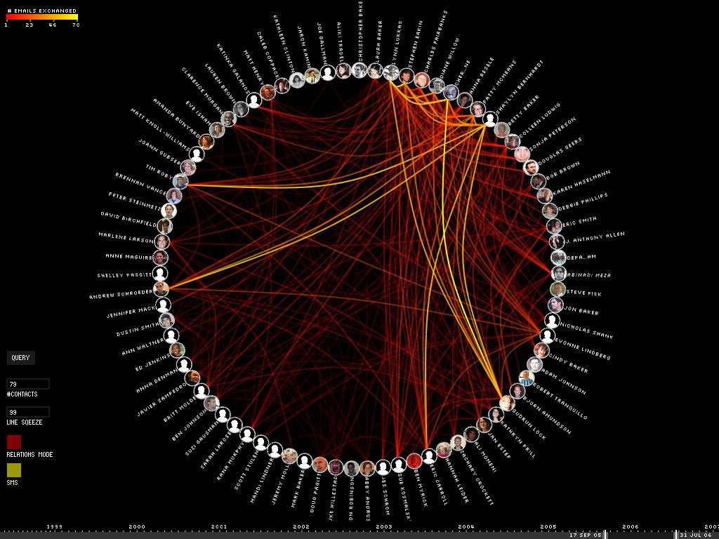
Like spirograph, but better: Email map by Christopher Baker
To some extent however this elegance, which makes data visualisation so immediately compelling, also represents a challenge. It’s possible that the translation of data, networks and relationships into visual beauty becomes an end in itself and the field becomes a category of fine art.
No harm in that perhaps.
But as a strategist one wants not just to see data, but to hear its story. And it can seem that for some visualisations the aesthetic overpowers the story. I spent many hours when younger staring at data tables, yearning for them to reveal a narrative. It is the prospect of bringing articulacy to hitherto cold, laconic facts that should be at the heart of the excitement around data visualisation.
The more compelling projects from Manuel’s archive did indeed seem to reveal some insightful truth about the relationships that they considered. Enron’s email patterns, the map of Segolene Royal’s supporters, the plotting of visitor eye traces in Barcelona, all looked extremely useful.

Enron Communication Graph, by Kitware Inc.
With this last instance in particular, one can start to imagine how understanding the dynamic patterns of tourist traffic around the city and its most photographed areas might enable the development of all kinds of helpful tools and services for both tourist and city.

Tracing the Visitor's Eye by Fabien Girardin
Manuel himself talked about ‘turning tools of curiosity into tools of functionality’. In this respect he quoted Chaomei Chen: ‘A taxonomy of information visualization is needed so that designers can select appropriate techniques to meet given requirements.’ And clearly this desire to enable greater utility is driving Manuel’s own research into the different methods and models of visual representation.
As a pioneer in his field, Manuel discussed the opportunities emerging in interactive data maps and he described a Californian experiment in which it should be possible physically to interact with a huge data set distributed about a six storey building. Blimey. I think I’ll leave that to the true data connoisseurs …
Finally, as a grey haired strategist, I found myself considering how the paucity of visual representation techniques had impacted the way we tackled problems in the past. I think we knew fundamentally that most events were precipitated by complex systemic pressures and relationships. But our limited power to disentangle the many elements in one system reduced us to characterising most strategic problems in rather monochrome ways.
So, this is progress indeed. Data visualisation has radically improved our understanding of these complexities. The real question is: what will we do with that understanding?
First published: BBH Labs 27/08/09
No. 1