Art Deco Tube Posters: The Legacy of a Visionary Client
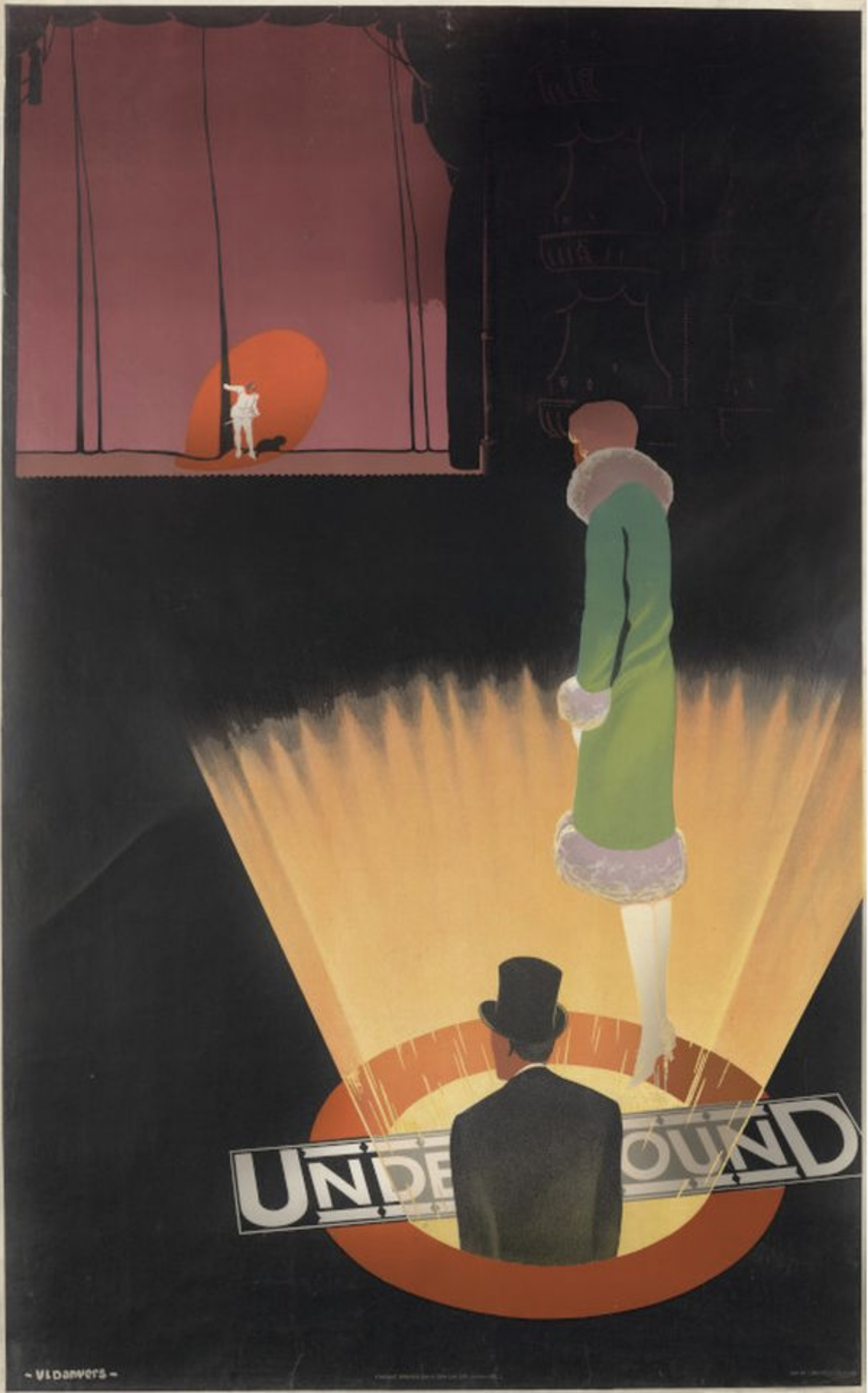
I recently enjoyed an exhibition of art deco posters commissioned by London Transport in the 1920s and ‘30s. (London Transport Museum, London, until May 2027)
Art deco, the movement characterised by clean lines, clear geometry and bold colours, flourished between the First and Second World Wars throughout Europe and the US. (It was given the art deco label retrospectively, in 1966.) The style influenced the design of architecture, automobiles and shipping; fashion, furniture and lighting. And the simplified aesthetic also lent itself particularly to print advertising.
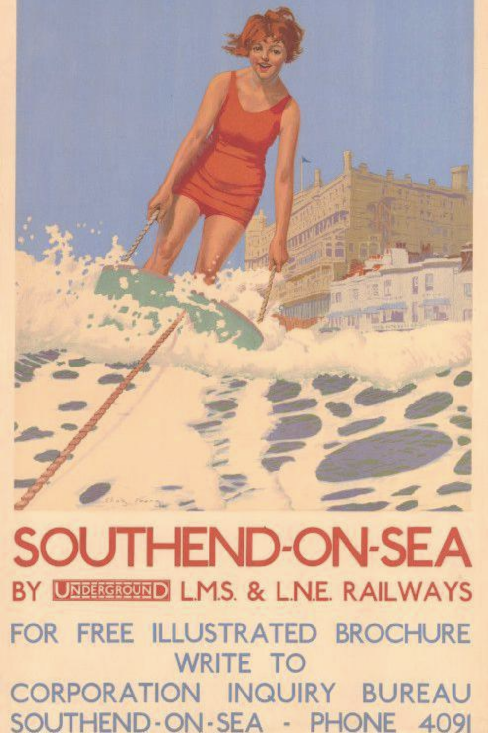
Over this period London Transport put up many and varied art deco posters - on vehicles, on bus stops and in tube stations. At a time when leisure was becoming more important, with new public holidays and paid annual leave, the campaigns promoted the glamour of modern life, accessible to all on bus, tram and underground services.
‘Hear, see, smell, touch and taste the riches of London.’
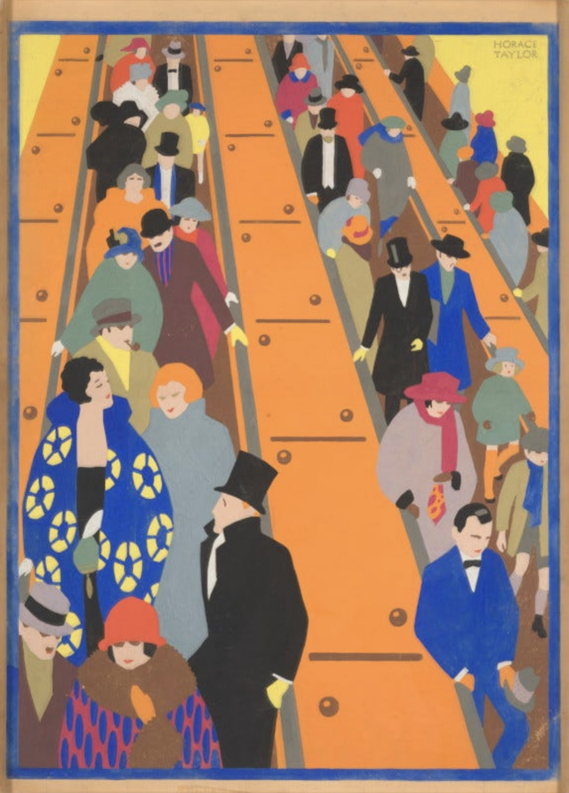
Visit the Zoo, Hampton Court or Kew Gardens. Take in the Winter Sales. A day trip to Southend perhaps? Or Wimbledon, Ascot, Lords? Why not watch the Boat Race, see the Motor Show or attend the Aldershot Tattoo? Join the glamorous theatregoers descending the escalators in their elegant coats and hats. Journey to the outskirts of the city to breathe fresh air.
‘Kenwood, cleaned and swept by the winds.’
‘Dark bluebells drench’d with dews of summer eves.’
‘It’s Crocus Time.’ ‘Daffodils are blooming.’
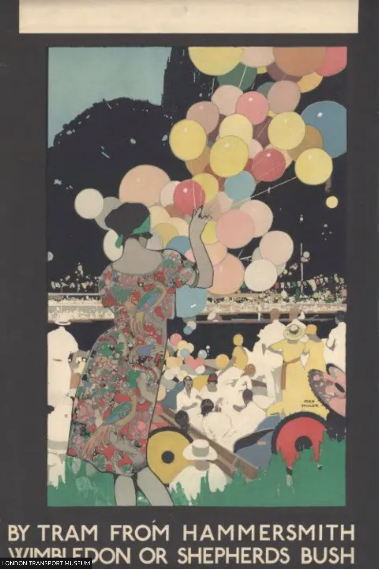
Posters also reminded Londoners of the tube’s speed and comfort, encouraged them to buy special fares and to fill empty seats outside rush hour.
‘Avoid the wet.’
‘Season tickets save trouble.’
‘Shop between 10 and 4, the quiet hours.’
The art direction was often exquisite. Strong, angular, minimal images, sleek and stylised, with vivid colours and sweeping curves.
What lay behind such a consistently impressive body of work? Well, first and foremost, a visionary client.
From 1908 to 1940 Frank Pick oversaw London Transport publicity, and he was appointed its first Chief Executive in 1933. Though he had been trained as a lawyer and had no particular creative education, he was committed to good design, believing it could enrich the quality of urban life.
'The test of the goodness of a thing is its fitness for use. If it fails on this first test, no amount of ornamentation or finish will make it any better; it will only make it more expensive, more foolish.’
Frank Pick
Pick commissioned the calligrapher Edward Johnston to design London Underground’s official sans serif typeface, known today simply as Johnston. He oversaw the development of the underground logo into the now world-famous roundel. And as the tube network expanded, he hired architect Charles Holden to design new station buildings in a modern, elegantly functional, style. Highlights included Piccadilly Circus, with its wide, circular, subterranean ticket hall; the Underground's new headquarters in St James's, with its sculptures of Day and Night by Jacob Epstein; the new Piccadilly line stations, with their geometric forms, flat rooves and high windows; Gants Hill underground, inspired by the Moscow Metro.
Pick had an eye for detail, and his passion for good design extended to new bus stops and shelters; to station furniture, lampshades and seating upholstery (known as moquette). Though at first sceptical, he signed off Harry Beck’s innovative diagrammatic tube map.
Pick introduced a consistent approach to advertising at stations, standardising poster sizes, limiting their number and controlling their positioning. And when he commissioned new ads, he identified artists working in modernist styles.
'There is room in posters for all styles… They are the most eclectic form of art.’
Pick was by no means perfect. He was a shy, moralistic, sometimes arrogant, loner, who was difficult to work with and reluctant to delegate.
'I have always kept in mind my own frailties – a short temper. Impatience with fools, quickness rather than thoroughness. I am a bad hand at the gracious word or casual congratulation.’
Nonetheless, I’m sure any creative practitioner today would accept such character shortcomings as a small price to pay for such an ambitious, progressive, far-sighted client.
Pick, who refused offers of a knighthood and peerage, died at home in Hampstead shortly after his retirement in 1941. Looking back on his achievements, in 1968 the historian Nikolaus Pevsner wrote:
‘He was the greatest patron of the arts whom this century has so far produced in England, and indeed the ideal patron of our age.’
'The distant echo -
Of faraway voices boarding faraway trains,
To take them home to
The ones that they love and who love them forever.
The glazed, dirty steps - repeat my own and reflect my thoughts.
Cold and uninviting, partially naked,
Except for toffee wrappers and this morning's paper,
Mr. Jones got run down
Headlines of death and sorrow - they tell of tomorrow
Madmen on the rampage.
And I'm down in the tube station at midnight.'
The Jam, 'Down in the Tube Station at Midnight’ (P Weller)
No. 580